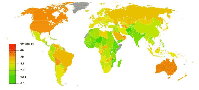
GHG emissions per capita
|
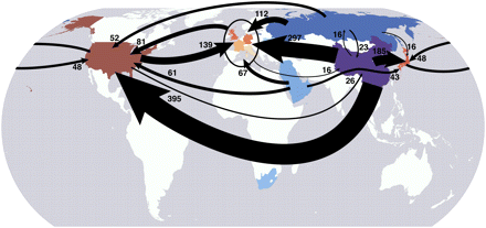
How is the map set up?Each country on the map has its own data. That is, the resolution of this map is at the country-scale. There may be differences within countries, but these are not shown on the map. What are the colors?The color tells you how much greenhouse gas is emitted by the average person living in this country during the course of a year: hence: GHG emissions per capita (per year). Greener colors mean less GHG emissions -- all the way down to a third of a ton per year. Redder colors mean more GHG emissions -- up to almost 70 tons per year. This scale is divided into six boxes. However, notice that the scale is NOT linear -- if it was linear, the scale would need to be about 200 boxes high, not 6 boxes, and only the bottom 30 or so boxes would be yellow or green. Where did the data come from?"GHG" means all greenhouse gases. CO2 is the most important, but other gases like methane (CH4, from cattle) and nitrous oxide (NO2, from fertilizers), both of which are less common but more powerful than CO2. "Emissions" means the amount of new GHG being put into the atmosphere. Remember that even if all emissions magically stopped tomorrow, the very high level of GHG already in the atmosphere would not disappear overnight -- they would take years to centuries to decay. "Per capita" literally means "per head". To find GHG per capita, you take the amount of GHG for the whole country and divide it by the size of the population. So, all of the manufacturing, farming, driving, etc., done in a country contributes to the per capita GHG emissions. Obviously this is an average -- a US resident who rides a bike and lives in a small apartment will be responsible for a much lower GHG emissions than one that drives a hummer and lives in a mansion. What does the data tell us?1. On average, residents of the US, Canada, and Australia are responsible for about 40 to over 100 times as much GHG emissions as those of Africa, India, and most of Asia. 2. The highest per capita GHG emissions in the world are in very small but oil-rich countries in the Persian Gulf -- you have to look hard to even see them... 3. Countries like China and Korea, that have been growing very quickly, are now responsible for about 1/4 as much GHG emissions per capita. As of 2005, the numbers were China: 5.5 tons/person; US: 23.5 tons/person. 4. The global average is about 6 tons per person (this is hard to tell from the map). What's the take-home message?The average American causes twice as much GHG emission as a European, 4 times as much as a Chinese person, and 40-100 times as much as an African person (but less than residents of a few very small oil-rich Persian Gulf countries). Is there controversy?Yes! One major problem is that we know that land use change (i.e., cutting down forests, turning rainforests into pasture) affects GHG emissions, but this is difficult to measure at the present. The map shown here DOES attempt to take land use change into account. Secondly, there is the issue of "outsourcing". For example, China manufactures and exports a wide array of goods to the US (TVs, iPods, shoes...). If we measure GHG in the country of consumption, it changes the figures a bit -- US emissions go up about 10% and Chinese emissions go down about 20%, so instead of US 23.5, China 5.5 (ratio 4.3 times higher in US) we would have US 26, China 4.5 (ratio: 5.7 times higher in US) The map below shows how GHGs are "outsourced":
|
Copyright University of Maryland, 2007
You may link to this site for educational purposes.
Please do not copy without permission
requests/questions/feedback email: mathbench@umd.edu