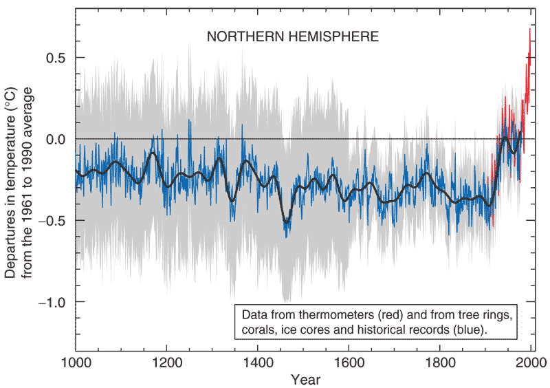
The Mann et. al Graph
|
What's on the y-axis?The last 1000 years. What's on the x-axis?The difference between temperature then and "now", in degrees Celsius. In other words, how much has temperature changed? "Now" was defined as the average temperature from 1960-1990. Where did the data come from?The red line on this graph comes from the "instrumental record" -- basically, thermometers around the world. Notice the red line starts around the year 1900, when thermometers were standardized. The blue line comes from "proxy" data -- tree rings, coral, ice cores, and historical records. For any given year, there are usually a wide variety of proxy data. The gray area represents uncertainty. Notice that uncertainty was a lot bigger before we had standardized thermometers! The black line shows a "smoothed" average, which makes it easier to see long-term trends. What does the data tell us?1. The temperature now is warmer than at any time in the past 1000 years. 2. Temperatures in the late 20th century were "anomalous" and "unprecedented" compared to the last 1000 years. 3. The difference between 1000 years ago and now is a bit less than 1 degree Celsius -- however, remember that this is a world-wide, year-round average. As you can see here, you would only see about 8 degrees decline in temperature with a full-blown ice age. What's the take-home message?Late twentieth century warmth is unprecedented in the last millennium – a result that has held up to a lot of scrutiny (below). Is there controversy?Yes! Mann et al., who created this graph, were the first to attempt such a long-range temperature "reconstruction". They pioneered many of the methods for combining data from tree rings, corals, etc. Scientists have disagreed about how this proxy data should be combined, and methods have advanced in the last decade, giving rise to many different interpretations of the same time period (see the next page). However, the much more eye-catching controversy was in the media. The IPCC chose Mann's graph to represent much of its work in both scientific meetings and on television -- making it the ultimate iconic graph of climate change as far as the public was concerned. Because of this, the graph was immediately attacked by climate denialists. At best, they said that the proxy data and methods to combine them were flawed -- and at worst, that the whole graph was a hoax. Eventually Congress asked the US National Academy of Science to investigate. After a thorough review, here is what the National Academy of Science concluded: "The basic conclusion of Mann et al. (1998, 1999) was that the late 20th century warmth in the Northern Hemisphere was unprecedented during at least the last 1000 years. This conclusion has subsequently been supported by an array of evidence that includes both additional large-scale surface temperature reconstructions and pronounced changes in a variety of local proxy indicators, such as melting on ice caps and the retreat of glaciers around the world." That's a pretty whole-hearted endorsement. To see the array of graphs produced by this array of evidence, go to the next page... |
Copyright University of Maryland, 2007
You may link to this site for educational purposes.
Please do not copy without permission
requests/questions/feedback email: mathbench@umd.edu