Stories about the Future
|
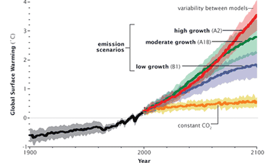
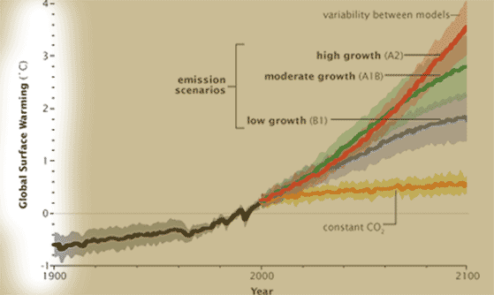
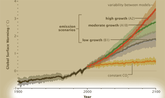
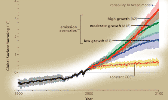
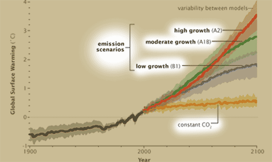
What's on the y-axis?Temperature difference -- "then" (year 2000) vs. "current" (whatever is being graphed). The solid lines represent model predictions, while the lighter areas show the spread of predictions by different models (see here to find out how this graph shows models written by scientists in many different countries). What's on the x-axis?The years from 1900 to 2100. In other words, half of this graph is in the past, half in the future. What do the different colors represent?In order to predict the climate, we need to know not only how greenhouse gases work (the basic job of the GCM), but also how much greenhouse gas there will be. The colors represent different future "scenarios" about human behavior -- basically, how many people there are in the world, how rich they are, and what technology and energy sources they use. As you can imagine, the impact of 9 billion people driving Priuses powered by windmills would be quite different from 15 billion people burning coal and oil! The yellow line shows what would happen in GHG emissions magically stopped tomorrow. The blue, green, and red lines show what will happen if we have low, moderate, or high growth of GHG emissions. So far our actual emissions are closest to the "high" (red) scenario. Where did the emissions scenarios come from?The IPCC has defined a large set of emissions scenarios -- 40 of them, in fact. They are grouped into 4 "families" (A1, A2, B1, and B2) depending on the assumptions made about population growth and energy usage. You can actually think of the scenarios as telling different "stories" about the future of our world. The most extreme scenario, "A2", tells a story about world population reaching 15 billion by the year 2100, and continuing to grow! However, in this scenario, different parts of the world use different fuel sources -- many countries use huge amounts of coal, but some countries use renewable energy or nuclear power. The "A1B" scenario is less extreme. In this possible story about the earth's future, a demographic transition occurs which limits population growth to only 9 billion (and world population even starts to decrease after 2050). Again, energy use is spread out among fossil fuels and renewables. The "B1" scenarios also assume that population growth peaks at 9 billion, but in this optimistic world, there is a massive move away from fossil fuels due to rapid development of green technology, and also a huge increase in the use of nuclear power. One often-used scenario that is NOT shown on this graph is "A1FI" ("FI" stands for "fossil intensive"). In A1FI, world population peaks at 9 billion people, but people all over the world adopt what we now think of as a "Western" lifestyle, and that all of this is supported by heavy use of fossil fuels. What do you think would happen to global warming in this case? The yellow line (constant CO2) is not a scenario at all. There is, in practice, no possible way that the world could halt the increase in CO2 in the atmosphere. The most ambitious international agreement to date, the Kyoto Protocol, only attempted to cut yearly emissions by about 5% -- but in reality, emissions rose by about 40% in the time period covered. What does the data tell us?The yellow line tells us that Even if we stopped emitting any GHGs cold turkey, we would STILL see warming of about half a degree. Halting all emissions would require that we stop burning fossil fuels and stop raising animals for meat, among other things -- in other words, a fairy tale. Under more realistic scenarios, we will see warming of 1 to 4 degrees. How much warming ultimately happens depends on world population growth, lifestyle, the development and spread and technology, and where we get our energy from. All of these affect CO2 emissions, and CO2 determines the amount of warming that is likely to happen. By the way, under the A1FI scenario (population growth peaks at 9 billion, Western lifestyles around the world supported by fossil fuel), warming is predicted to be between to 2 to 6 degrees. What's the take-home message?At this point, some level of global warming (1 to 4+ degrees) is unavoidable, but our decisions about population growth, lifestyles, technology, and energy use will have a big impact in the level of eventual damage. Is there controversy?There is not too much controversy in the media, mostly because this is very technical stuff that most people have never heard of. Scientifically, there isn't much controversy either, because the IPCC scientists refuse to rank the scenarios. That is, they do not say how probable each of the 40 scenarios is. However, some studies, such as one from MIT, suggest that the IPCC scenarios are actually rather optimistic, because they assume some level of attempting to control CO2. The MIT scientists calculated a "no-policy" scenario -- assumting the world remains mired in denialism and does not achieve effective policies limiting or mitigating CO2, then eventual CO2 levels could be much higher, leading to even more warming. |
Copyright University of Maryland, 2007
You may link to this site for educational purposes.
Please do not copy without permission
requests/questions/feedback email: mathbench@umd.edu