Multiple Global Circulation Models (GCMs)
Schematic showing how a GCM (Global Circulation Model) works: 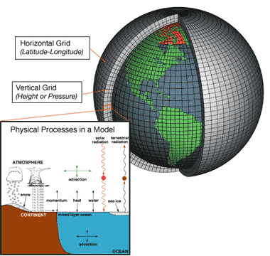 |
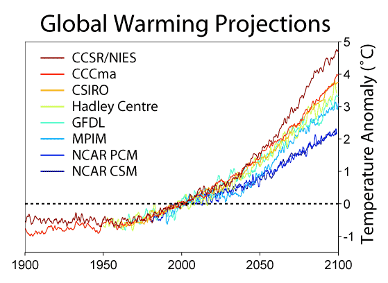
What's on the y-axis?Temperature difference -- "then" (year 2000) vs. "current" (whatever is being graphed). However, it is important to realize that ALL of the data on this graph come from model PREDICTIONS, not measured or reconstructed temperatures. It might seem odd to use a model to "predict" what happened 100 years ago -- however, it is a necessary step in finding out whether the model really works! Sometimes this is called "back-prediction", like using a model to travel backwards in time. This graph is compares back- and forward-predictions from 8 different models. What's on the x-axis?The years from 1900 to 2100. In other words, half of this graph is in the past, half in the future. Where did the projections come from?Each different colored line on the graph shows 200 years of predictions from a single global circulation model, or GCM. So what is a GCM? Basically, it is a huge computer program which turns the globe into a 3-dimensional grid, and computes the movement of heat, air, moisture, etc., through the grid. When I say huge, I really mean huge. A typical GCM keeps track of several million grid boxes, each of which might represent 100x100 miles. Typically each grid update represents 20 to 60 minutes. Supercomputers are needed to run these models. Creating a GCM is not an amateur hobby either. Here's where they come from: CCSR/NIES: Japan: a collaboration between the University of Tokyo and the (Japanese) National Institute for Environmental Science. CCCma: Canada: the Canadian Centre for Climate Modelling and Analysis CSIRO: Australia: basically the National Science Agency of the Australian government Hadley: England: The Hadley Centre, established by Prime Minister Margaret Thatcher GFDL: US: the National Oceanic and Atmospheric Administration (NOAA), better known as the people who study and predict the weather. MPIM: Germany: the Max Planck Institute for Mathematics NCAR: US: co-operation between a number of US agenics: the Dept of Energy, the National Center for Atmospheric Research, the Naval Postgraduate School, the Army Corps of Engineers, and others. What does the data tell us?GCMs are incredibly complicated models. Scientists based in six different countries, working independently, came up with models that consistently predict overall warming. This is strong support for the basic validity of these models. Notice, however, that different models do predict different results. The Japanese model is the most extreme, with almost 5 degrees of warming over the next 100 years. The US NCAR models are the least extreme, with only 2 degrees of warming. What's the take-home message?Models developed independently in six different countries predict between 2 and 5 degrees warming over the next 100 years. Is there controversy?Of course there is a lot of heated scientific discussion about whose model is the best. But in addition... Climate change denialists sometimes allege that the entire idea of climate change is a hoax, a conspiracy, or a way for unscrupulous scientists to make money. If so, the "conspiracy" involves thousands of scientists accross the world -- and US scientists are among the most conservative! |
Copyright University of Maryland, 2007
You may link to this site for educational purposes.
Please do not copy without permission
requests/questions/feedback email: mathbench@umd.edu