Worldwide Climate Network

Schematic for a standard weather station. The weather station takes 6 different measurements: air and surface temperature, precipitation, relative humidity, solar radiation, and wind speed. A data logger stores data at 15 to 60 minute intervals. Rollover to see a real-life station. |
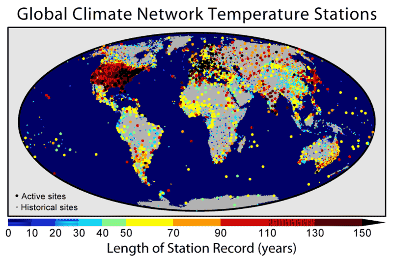
What are the dots?Each dot represents a single weather station that measure temperature, precipitation, and air pressure. Why are they different sizes and colors?The very small dots are historical stations, no longer in use. The colors represent the number of years the station has been operating. Altogether there are about 7000 stations, with about 2000 currently in use. The oldest station, in Berlin, has been operating since 1701. Who runs the weather stations?These weather stations form the NOAA climate network (NOAA=National Oceanic and Atmospheric Administration). It is not the only climate network in the world (the Hadley Centre in England has its own climate network, for example) but it is one of the largest. What does the map tell us?We know most about the temperatures in Europe, the US, and Japan, because that's where the most data has been collected. However, data has been collected and continues to be collected from all over the world. What's the take-home message?Statements like "2010 was the second hottest year on record" have a lot of data behind them. Is there controversy?Well, yes. Climate denialists have made an industry out of contesting the location and accuracy of these weather stations. On wattsupwiththat.com, which claims to be the "world's most viewed site" on climate change, Anthony Watts claimed that weather station sites were often situated in "urban heat islands", thus artificially inflating the temperatures, and he asked for volunteers to photograph weather stations to substantiate his claim. However, these siting problems are well-known in the scientific community. Yes, some sites were established back before a city grew up around them -- and in fact the temperature record is simply corrected (i.e., reduced) to account for the effects of urban heat. Moreover, numerous studies have shown that there is no systematic bias in the temperature record. Finally, an overlay of where warming is taking place and where cities are located shows no relationship. |
Copyright University of Maryland, 2007
You may link to this site for educational purposes.
Please do not copy without permission
requests/questions/feedback email: mathbench@umd.edu