More temp. models
|
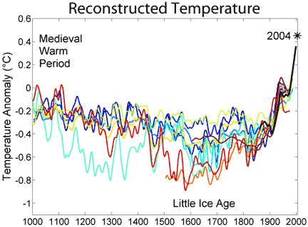
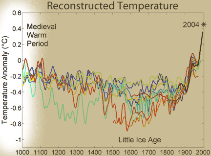
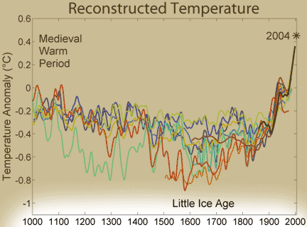
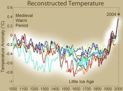
What's on the y-axis?The last 1000 years. What's on the x-axis?The difference between temperature then and "now" (1960-1990), in degrees Celsius. Where did the data come from?Each line represents 1 peer-reviewed study. Including the original Mann study (see here), there are about a dozen datasets in this one graph. The black line in the most recent years shows the "instrumental record" -- i.e., actual temperature readings taken with networks of standardized thermometers. What does the data tell us?Although there is a lot of variability between different reconstructions, on the whole they tell the same story: lower, slightly declining temperatures during the first 950 years, rapidly rising temperatures after that. What's the take-home message?Temperature toward the end of the 20th century was warmer than in any of these dozen reconstructions. Is there controversy?This graph is in some ways a response to the controversy over the original Mann reconstructions (the "hockey stick" graph). It supports and extends Mann et al.'s conclusions -- no matter how you slice and dice the data, the late 20th century was still "unprecedentedly" warm. Or, as Mann put it after extending his original analysis to 2000 years: "You can go back nearly 2,000 years and the conclusion still holds–the current warmth is anomalous. The burst of warming over the past one to two decades takes us out of the envelope of natural variability." |
Copyright University of Maryland, 2007
You may link to this site for educational purposes.
Please do not copy without permission
requests/questions/feedback email: mathbench@umd.edu