Natural or Human?
|
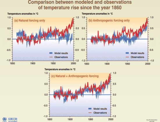
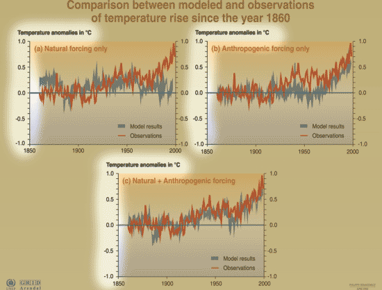
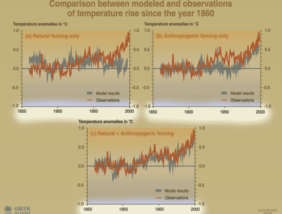
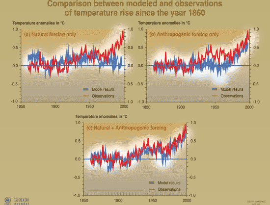
What's on the y-axis?Temperature difference between "then" and "now" (as in the Mann graph or the multiple temperature reconstruction graph). Blue shows model results; red shows observed temperatures. Remember, the time covered by this graph is all part of the "instrumental record", so we have pretty a pretty good idea of what actual temperatures were like. Logically enough, the red line is the same on each of the 3 graphs. What's on the x-axis?The last 160 years. Where did the data come from?These graphs put two sets of data together: 1) temperature reconstructions based on the instrumental record (see here) -- these are the series in red. 2) model predictions based on global circulations models (GCMs, see here) -- these are the series in blue. Ideally, we would like the model predictions to match the actual data. Which graph does this occur in? So why are there 3 graphs?This set of graphs is really an attempt to answer the question "is climate change natural, or is it caused by humans, or both?" As we saw with the 400,000 year ice core temperature record, climate does vary on its own, without help from humanity. So, maybe the climate change we are seeing now is just a natural effect? The first graph shows what the models predict if we ONLY use natural factors (like the wobble of the earth). In other words, out of the thousands of pages of computer code that make up the model, we use ONLY the code relating to natural phenomena. This is called "natural forcing". The second graph shows model predictions for ONLY human-caused factors (greenhouse gases, habitat loss, etc). This is called "anthropogenic forcing". Neither of the first two graphs fits the data very well. That means neither natural nor human forcing explains the observed climate very well on its own. But the third graph shows model predictions using both natural and human caused factors, the predictions are much better. What's the take-home message?Natural-only models don't show late twentieth century warming, while human-only models show temperatures that are slightly too high. The human+natural models give a much better fit to the actual data. This is strong evidence that human-caused ("anthropogenic") factors are critical to the warming that we are now seeing. Is there controversy?Some climate-change denialists admit that the climate is changing, but claim that humans have nothing to do with it (it's all a natural process). This set of graphs is a rebuttal to the all-a-natural-process thinking. These graphs tell us that, although natural causes for climate change have always existed, what we are seeing right now is far outside of the natural climate variability -- in particular, it is happening much faster than we would expect from natural processes alone. |
Copyright University of Maryland, 2007
You may link to this site for educational purposes.
Please do not copy without permission
requests/questions/feedback email: mathbench@umd.edu