A Warmer World
|
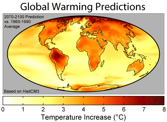
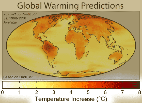
What are the colors?Darker colors represent more heat -- up to 8 degree increase in temperature after about a century (2070-2100 compared to 1960-1990). Where did the data come from?This particular set of predictions comes from the Hadley Centre in England, which runs one of the major GCM models, described here. There are similar maps for the other GCM models, so this is just one possibility. What does the data tell us?Well, land will generally warm more than ocean -- that's because of the way that large bodies of water buffer temperature increase. Virtually all continental areas are predicted to warm by at least 3 degrees. And the greatest warming will happen in Arctic regions. This is a concern because, as land-ice melts, it raises sea levels... But wait, usually I hear 2 or 3 degrees of warming -- why does the map go up to 8 degrees...??!The graphs, such as the one I show here and here, are for global average temperature. This map shows local temperature all over the world. Some areas are predicted to have higher levels of warming, some to have lower levels. What's the take-home message?Some parts of the world will be better off than others, but everything is getting warmer! And some parts will get really warm... (imagine the Amazon hotter by 8 degrees Celsius, or 14 degrees Fahrenheit). Is there controversy?You mean other than the standard let's-stick-our-heads-in-the-sand deny-that-global-warming-is-real controversy? Sure, other GCMs give maps that look slightly different -- local forecasting is hard, and no one is suggesting that you should pick a location for your family reunion in 2100 based on these maps, but is it going to be hotter? Yes. |
Copyright University of Maryland, 2007
You may link to this site for educational purposes.
Please do not copy without permission
requests/questions/feedback email: mathbench@umd.edu