CO2 and Temp
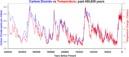
 Scientists use ice cores to determine past CO2 levels and past temperature: |
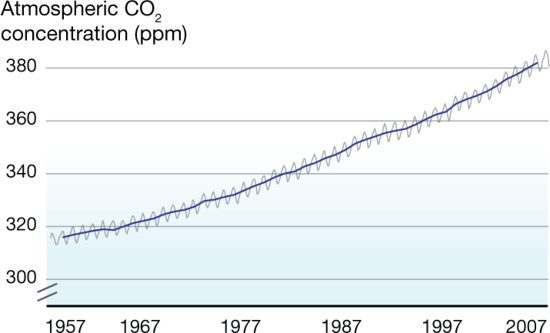
What's on the y-axis?On the left (blue) axis is the amount of CO2 in the atmosphere, which is measured in ppm, or parts per million. So at the beginning of the graph, there were about 275 molecules of CO2 for every 1,000,000 molecules of air (which is mainly oxygen and nitrogen). On the right (red) axis is temperature change -- that is, the difference between historical and present day temperature. So, at the beginning of the graph, temperature change was about 0, meaning temperature about the same as today, whereas the 4 periods where the red line dips very low represent temperature 8 degrees colder than our current average temperature. What's on the x-axis?Time -- in this case, years before the present. This graph goes back 400,000 years. So how long is 400,000 years? For comparison, humans invented agriculture about 10,000 years ago, (probably right after temperature rose for the last time on the graph). Homo sapiens is thought to have evolved about 250,000 years ago. What is not included in the last 400,000 years? Well, the first humanoids (Homo habilis) started using tools over 2 million years ago, while dinosaurs lived more than 65 million years ago. Where did the data come from?Short answer: ice cores in the Antartic. Longer answer: As long as you can find ice that has stayed consistently frozen, you have a historical record that goes back as far as 800,000 years. Air bubbles trapped in the ice tell us how much CO2 was in the air. For temperature, it's a little more complicated. Basically, scientists measure the amount of "heavy" oxygen ( isotopes with extra protons) in the ice -- the more heavy oxygen, the higher the temperatures. If you want the gorey details, by all means look at the article listed at the bottom of the page! What does the data tell us?1. See those temperature dips? Those are ice ages. The difference between the climate we have now and an ice age is only about 8 degrees celsius, or about 14 degrees Fahrenheit. Why? Remember that we are talking about average temperatures all over the world. In particular, land temperatures are more variable than the ocean temperatures, so the ocean might be a little colder, while the land is a lot colder. Or, summer temperatures could fall a lot and winter temperatures only fall a little -- this would be enough to cause year-round winter! 2. Basically, and most importantly, there is a very good fit between CO2 levels and temperature. 3. Remember what CO2 is doing right now? On the Keeling Curve page, the average CO2 in 2007 was about 385 ppm. Where is that on the 400,000 year graph??? (That was a bit of a trick question -- the answer is that 385 ppm is not on the graph, it's off the graph -- way off. If you've seen An Inconvenient Truth, this is the part where Al Gore gets into the bucket lift to dramatize just how high our current CO2 levels are.) What's the take-home message?CO2 is above -- waaaayyy above -- historical ranges for the last 400,000 years. This implies that we could see temperatures way outside of historical ranges as well. Is there controversy?Yes, but nothing that challenges the basic science. First of all, the methods for estimating CO2 and temperature from ice cores are constantly being tweaked and improved. So far none of these changes have changed the overall picture. Look here for a user-friendly explanation of how ice cores can be used to determine CO2 and temperature. Some climate change deniers have pointed out that, in general, temperature starts to rise about 800 years BEFORE CO2 starts to rise. This is true, and furthermore, the effect was first predicted and confirmed by climate change scientists themselves -- basically, a slight increase in temperature due to the earth's wobble "primes the pump" for soils and oceans to release stored CO2. The released CO2 then causes much more warming. If you want to see this particular denialist myth debunked in a way that is both funny and rigorous, watch this (about 12 minutes). |
Copyright University of Maryland, 2007
You may link to this site for educational purposes.
Please do not copy without permission
requests/questions/feedback email: mathbench@umd.edu