Graphing on a log scale
What happens when you graph on a log scale? Each increment of your axes increases by a factor of 10 (also called an order of magnitude) rather than by equal increments. What do we mean by this?
Let's think about it in terms of our mammal data.
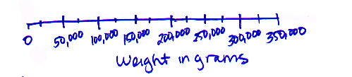
Our full data set lists the size and metabolic rate of 600 mammals that range in size from 2.5 grams (a shrew) to 325,000 grams (a moose). If we graph that on a normal scale, we might start with 0, then increase the scale in increments of 50,000 until we reach 350,000 (that would capture our entire shrew to moose range). Our axis would look like this:
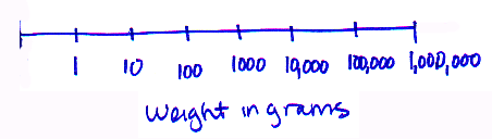
What happens if we change to a log scale. This time, instead of equal increments of 50,000, we are going to increase by an order of magnitude (a factor of 10) for each step along the axis:
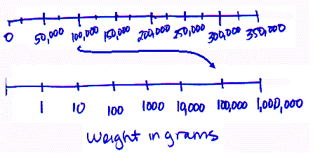
Notice how this drastically changes where the actual numbers occur - in the normal graph, the majority of the scale is taken up by the range between 50,000 and 350,000. In the log scale, these numbers occur in a very small section near the end. The log scale draws out the area where the smaller numbers occur. Look where the value "100,000" shows up along each scale:
The above log-scaled axes still display the actual values of the weight. But log-scaled graphs are often portrayed with the values of the log labeled on the axis. For graphs with data displayed this way, just remember that each number represents the number of zeros after the "1" (when positive) or after the decimal point (if negative). Also, notice that the label specifies that the values are the log of the weight (rather than the weight itself).
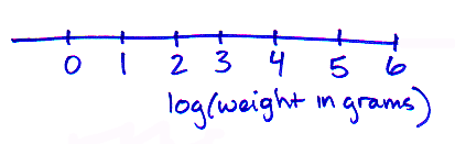
Displaying data in this way reminds us that the group of mammals we are considering spans six orders of magnitude in terms of their weight!
| Want more practice with graphing on a log scale? Visit the Log Transformations MathBench module. |
Copyright University of Maryland, 2007
You may link to this site for educational purposes.
Please do not copy without permission
requests/questions/feedback email: mathbench@umd.edu