Practice labelling the axes
Now that you know what goes on the what axis, try labelling the axes. In general, your label should have two parts: what you measure, and how you measure it, or units. Units should be in parentheses. Like this: "distance (cm)" or "time (minutes)" or " eyesight left (%)".
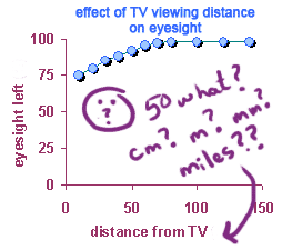
Putting in the units allows your reader to interpret the graph. For example, if you are graphing the grade received on a test vs. the time spent studying, it will make a big difference whether the x-axis reads "time studying (hours)" or "time studying (minutes)"! Likewise, its hard to interpret the graph on the left, because you don't know what the units are:
 |
 |
Below, I've written the "x" variable label, but you need to think of a possible "y" varible label. There are many possibilities, so think of one, then click "compare" to see whether you're on the right track. In some cases the units are not very obvious and might take some thinking.
Write a label for "y"...
To make this interactive, turn on javascript!
| "x": grams of food fed per day | |
| "y": daily growth rate of mouse | |
Did you pick some unit other than grams/day for growth of mice? That's OK -- there are a lot of different ways to measure the same thing. BUT, that's also the reason that it's important to tell people HOW you measured your variables!
Write a label for "y"...
To make this interactive, turn on javascript!
| "x": temperature in tank | |
| "y": # surviving fish in tank | |
Write a label for "y"...
To make this interactive, turn on javascript!
| "x": year | |
| "y": number of deer | |
Write a label for "y"...
To make this interactive, turn on javascript!
| "x": dosage of Dilaudin | |
| "y": time to relief of pain | |
Write a label for "y"...
To make this interactive, turn on javascript!
| "x": time since conception | |
| "y": # cells in embryo | |
Write a label for "y"...
To make this interactive, turn on javascript!
| "x": amount of studying | |
| "y": grade on test | |
Copyright University of Maryland, 2007
You may link to this site for educational purposes.
Please do not copy without permission
requests/questions/feedback email: mathbench@umd.edu