The Case of the Confusing Axes
In this module we'll talk about how to graph data, and particularly how to set up the graph (I know you're good at putting dots on a graph once the axes are labelled and all the little tickmarks are drawn in!)
Believe it or not, every TA gets a handful of reports each semester where the graph has axes that are switched, or the graph is all squashed into one tiny corner of the paper, or nothing is labelled. Well, those reports don't have to come from you! Below you will find an easy checklist to making the perfect graph. On the following pages, we'll practice some of the skills you will need...
-
Checklist:
- Choose your x and y variables carefully.
- Label your x and y axis using both a description and the units in parentheses, and the top of the graph with a description of what the graph shows
- Figure out the best minimums and maximums for x and y
- Figure out the best distance for ticks.
- Include a legend if there's more than one data series
- Graph the data!
I'm going to quickly show you these steps on a single graph, and then as we go through each step more slowly, I'll show you the sorts of trainwrecks that occur if you ignore these steps.
 A Sample Graph: Eyesight and TV Viewing Distance
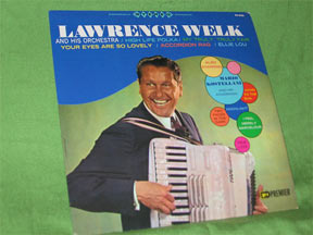
When I was growing up, the older folks frequently rained dire predictions on our head about our viewing habits. Specifically, we sat too close to the color television, which was thought to have alien powers akin to Martians landing on the roof (nowadays I suppose parents warn their kids about cell phones ruining their hearing or IMing ruining their thumb joints -- mine was a more innocent age). Anyway, I could imagine my poor grandmother collecting the data for the graph below, hoping to prove her point and force us to sit farther from the Lawrence Welk show:
| viewing distance | 10 | 20 | 30 | 40 | 50 | 60 | 70 | 80 | 100 | 120 | 140 |
|---|---|---|---|---|---|---|---|---|---|---|---|
| eyesight remaining | 75 | 80 | 85 | 88 | 92 | 95 | 97 | 98 | 98 | 98 | 98 |
- Choose x and y variables:
x: viewing distance is the independent variable
y: eyesight remaining (because it depends on viewing distance) - Label your x and y axis:
x: "distance from TV (cm)"
y: "eyesight left (%)"
graph: "effect of TV viewing distance on eyesight" - Minimums and maximums
x: 0 to 150
y: 0 to 100  Tick distance
x: 50
y: 25- Legend (if there's more than one data series)
lucky us, we don't need a legend - Graph the data!
Copyright University of Maryland, 2007
You may link to this site for educational purposes.
Please do not copy without permission
requests/questions/feedback email: mathbench@umd.edu