Beyond the scatterplot
A few modules ago, in A Graphing Primer, we reviewed scatterplots. And we made lots of scatterplots (yeah, I got to make them too, remember?). Lots and lots of scatterplots. In fact, every single plot we made was a scatterplot. Does this get a little boring?
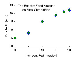
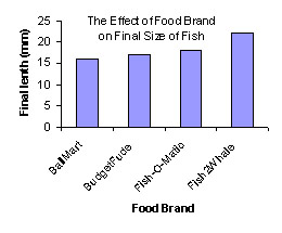
In this module, we'll spice things up with some other kinds of graphs. Below are two graphs relating to fish food.
 |
 |
|---|
The one on the left is obviously a scatterplot. The one on the right is a bar graph -- it has, um, bars on it. But how do you know that you need to use a bargraph for your data? Here are the data tables for these two graphs:
| scatterplot | vs. | barchart | ||||||||||||||||||||||||||
|---|---|---|---|---|---|---|---|---|---|---|---|---|---|---|---|---|---|---|---|---|---|---|---|---|---|---|---|---|
|
|
What is the essential difference between these two data tables? If you said, the first datatable is all numbers, but the second datatable has some stuff that is not numbers, then you are correct. " Some stuff that is not numbers" is known in the mathematical world as "non-quantitative data". The word "quantitative" means able to be quantified or counted. In other words, a number. "Nonquantitative data" is also called "qualitative data." In this case, "qualitative" means data that you can qualify, or describe, but not count.
Quantitative data can be put on a quantitative axis, but qualitative data can't. You just can't put "type of fish food" into units of tens or fifties or hundreds. So, I have four categories in this data table, and the best I can do is simply list each category on x-axis.
Copyright University of Maryland, 2007
You may link to this site for educational purposes.
Please do not copy without permission
requests/questions/feedback email: mathbench@umd.edu