Error bars
So the question is, how can we average the data but still keep enough information to get a good sense of what the unsummarized data looked like? This is where statistics comes to the rescue. In fact, there is even more than one way to do this in statistics. I'll show you one way on this page, and a second way on page 8.
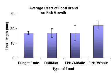
The First Way: Say you want to know how much the data varied. For example, the company buying Fish2Whale might simply want to know the range of fish sizes they can reasonably expect after 4 weeks. In this case you would use the standard deviation of final fish size.
As you saw on the last screen, the "standard deviation" is calculated with a slightly different formula than the "average deviation". However, you can use the average deviation formula to get a general idea of the SD, and you can calculate the SD automatically by using a graphing calculator or a spreadsheet.
Once you know the mean and standard deviation of the data, you can make your bar chart. You need to label, range, scale, and fill in your axes as usual. HOWEVER, when you determine the maximum values for your axes, make sure to consider the average PLUS 1 SD. Put your mouse over the image below to see how the maximum value of the y-axis is SMALLER without the error bars.
| If you turn on javascript, this becomes a rollover |
Finally you make bars for each average value and add "error bars" for each standard error. The "error bars" are not actually rectangles, but vertical lines with a little cross bar at the top and bottom. The line starts at the top of the rectangle and the length of the line represents the size of the standard deviation (in other words, the line stops at mean + standard deviation). You can optionally do the same thing heading down as well, as shown on the graph above.
Copyright University of Maryland, 2007
You may link to this site for educational purposes.
Please do not copy without permission
requests/questions/feedback email: mathbench@umd.edu