How to make a fancier bar chart
We're not even going to practice making bar charts, but we'll go right on to adding bells and whistles.
Remember that your boss wants you to show that Fish2Whale is better than the competitor brands (Budget Fude, Ballmart, and Fish-O-Matic). On the first screen, I showed one possible graph:
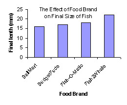
To make this graph, your boss started with 4 equal-size fish and fed one type of food to each fish. Although the results are certainly promising (the Fish2Whale fish ended up considerably bigger than the other 3 fish) it is far from being a slam-dunk.
Most importantly, your boss only tested each food on a single fish. As we discussed in the module on the Normal Distribution, virtually all scientific experiments involve some level of natural variability. Some fish are naturally larger, stronger, happier, whatever... and they grow faster.
So what you need to do is repeat -- or more impressively, to "replicate" -- your treatements using several similar fish.
Time passes.
Fish grow.
Finally the results of your experiment are ready... good news for the company. Here is your datatable, and a possible graph:
| Fish # | 1 | 2 | 3 | 4 | 5 | 6 | 7 | 8 | 9 | 10 | 11 | 12 |
|---|---|---|---|---|---|---|---|---|---|---|---|---|
| Brand | BF | BF | BF | Bmart | Bmart | Bmart | F-O-M | F-O-M | F-O-M | F2W | F2W | F2W |
| Final Length (mm) | 16 | 17 | 18 | 14 | 17 | 20 | 12 | 17 | 22 | 19 | 22 | 25 |
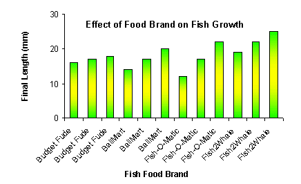
Hmm, this graph is kinda funny looking. Other than a criminal use of gradient fills, what did your boss do wrong?
Drawing 12 bars seems like a little bit of overkill. Maybe there is a way to summarize the data?
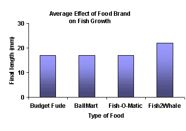
What we really want to know is, what was the AVERAGE growth for each type of fishfood, right? So let's try taking some averages. Now our datatable looks like this:
| Fish # | 1 to 3 | 4 to 6 | 7 to 9 | 10 to 12 |
|---|---|---|---|---|
| Brand | BF | BMart | F-O-M | F2W !! |
| AVERAGE Final Length (mm) | 17 | 17 | 17 | 22 |
And your new, improved graph looks like this:
Copyright University of Maryland, 2007
You may link to this site for educational purposes.
Please do not copy without permission
requests/questions/feedback email: mathbench@umd.edu