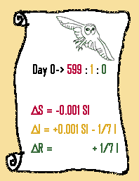
The Whole Enchilada
So we have deduced that the rate of infection depends on both the number of uninfected and the number of infected, and is approximately 0.0001 SI. That term is added to I and also subtracted from S, so now we have the final equations:

The scroll above specifies the whole model – in other words, what the initial conditions were, and how they changed over time. Before I show you the whole graph, let’s think about it SHOULD look like.
First, S: The rate of change of S is always negative, so S will always go down. It changes fastest when S and I are both moderate sized – therefore, somewhere in the middle. Draw the shape of this curve on the graph below:
Next, R: The rate of change of R is always positive, so R must always go up. It will increase the fastest when I is big, but so far we don’t know when that is. So, don’t try to draw it yet.
Finally, let’s tackle I. We know there’s one term that increases I, and one that decreases it. Remember how we analyzed this before, looking at when delta I was positive and when it was negative? Let’s do the same thing again.
- Delta I will be positive when 0.001 SI > 1/7 I. What do you get when you simplify this? (javascript button: cancel the I’s and divide both sides by 0.001, and you find that the condition for a positive rate is S > 142.)
- Likewise, delta I will be negative at 0.001 SI > 1/7 I, or S < 142.
So now we know something very interesting. The model predicts that the outbreak will only continue to grow as long as S > 142. Look again at the derivation above if you don’t understand this, because it’s one of the most significant predictions made by the model. To recap: while there are at least 142 students who have never gotten pigeon pox (S > 142), the number of infected students continues to rise (delta I is positive). As soon as the number of never-sick students drops below 142, the number of infected students starts to fall. And, because there is no way in the model to replenish the S compartment, the number of infected students will continue to fall and the outbreak will die out.
So now try putting the line for I on the graph. Remember, I should peak at the SAME TIME that S reaches 142. Then, add the line for R, remembering that R always rises, and that it rises fastest when I is high. Finally, click the “check” button to check your results!
Were you close? And more importantly, did you get the shapes right? If not, read over the explanations and try it again.
Copyright University of Maryland, 2007
You may link to this site for educational purposes.
Please do not copy without permission
requests/questions/feedback email: mathbench@umd.edu