>Episode 2: Hardy and Weinberg to the rescue
The HW graph
|
While sitting down to lunch, the Assistant was joined by the Other Assistant, the one who never seemed to do anything, yet never got fired. "Watcha eating?" said the OA. "Soup," replied the Assistant, hoping the OA would go away. "What kind?" persisted the OA. "Wrinkled pea," replied the Assistant. "Just so long as there isn't a hare in your soup,eh!" said the OA punching the Assistant in the arm. He sat down, despite the distinct lack of an invitation. "So, I hear you're working on the Blue Hair Syndrome case." "Yup," slurped the Assistant through his rolled tongue. "We've got to do something about that Blue Hair Syndrome. Blue Haired people make me jumpy." "I read that somewhere." "Absolutely," said the OA. "We ought to have a rule around here against hiring people with blue hair." "I'm pretty sure that violates some Constitutional Right." "I don't remember anything in the Constitution about blue hair," said the OA. The assistant nodded sagely. "What about carriers? They have the allele too, but you can't identify them by sight. In fact, right now there are more carriers than blue-haired people -- I mean, since q=22%, we have 5% blue-haired people, but 34% carriers!" "What if we lowered q to 10%? Then blue-haired people are only 1% of the population, and carriers are 18%, right?" "Sure. Or if q was 1%, then blue-haired people would only be 0.01%, and carriers would be just under 2%." "All these numbers are making my head hurt," moaned the OA. |
| %Brown Haired | %Carriers | %Blue Haired |
| p2 | 2pq | q2 |
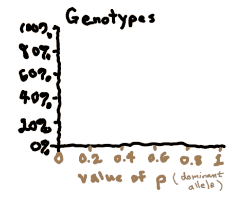
A graph is a good way to summarize a lot of information. Rather than calculate the proportions of brown/carrier/blue-haired people for lots of different values of p and q, we can just make a graph and see the relationships at a glance.
 When making this graph, want to know how the allelic frequencies affect the genotypic frequencies. So we'll put allelic frequency on the x-axis, and genotypic frequency on the y-axis, like so:
But how exactly can we put "allelic frequency" on the x-axis, given that there are two different frequencies (p and q)? Basically we just need to agree on one of them. Since p is the proportion of the dominant allele, so we'll choose that one. (We could choose q, just to be different, but then the graph wouldn't look like the one in the textbook).
Likewise there are three genotypic frequencies to put on the y-axis, but this is not so bad, because we can just make three lines.
It should be easy to plot p2. However, how do we plot q2? The crucial thing to remember is that there is a necessary relationship between p and q -- they must add up to 1. So, it must be true that q = 1-p. Instead of plotting q2, we need to plot (1-p)2.
Likewise, to plot 2pq, we need to plot 2p(1-p).
See if you can make these plots yourself before rolling the mouse over the graph to see the answer.
| #Brown Haired | #Carriers | #Blue Haired |
| p2 | 2pq | q2 |
| p2 | 2p(1-p) | (1-p)2 |
Copyright University of Maryland, 2007
You may link to this site for educational purposes.
Please do not copy without permission
requests/questions/feedback email: admin@mathbench.umd.edu