Temperature variability revisited
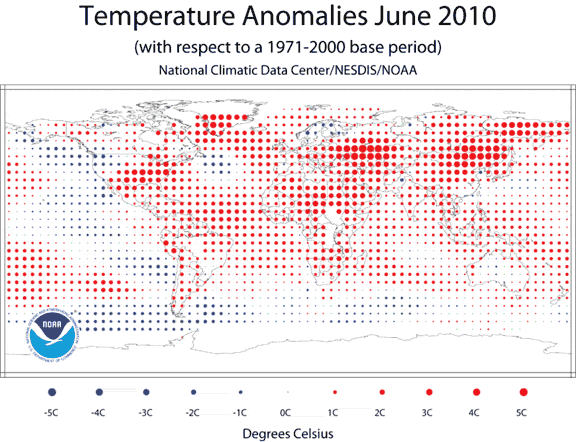
Here's another way of looking at worldwide temperature for a single year. Each dot shows a comparison between actual temperature in 2010 and average temperature.

The average temperature shift for LAND SURFACES in 2010 was 1.7 degrees, and for OCEANS was 0.9 degrees. You can see though that this shift was unevenly distributed. Large red circles show places where the temperature was 4 or 5 degrees hotter than the base period -- mainly Canada, Saharan Africa, and the Middle East. Blue dots show where the temperature was cooler, including Europe, part of Siberia, and the Eastern Pacific Ocean.
Copyright University of Maryland, 2007
You may link to this site for educational purposes.
Please do not copy without permission
requests/questions/feedback email: mathbench@umd.edu