Enough with thermometers and trees already!
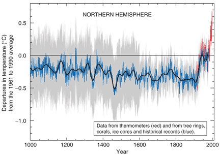
OK, let's finally move on to the data itself, and let's look at the black line, which is the overall trend.
We know that this line is measuring the difference of temperature compared to the "good old days" of 1961 to 1990. Therefore, we would expect that the black line for 1961 to 1990 should be pretty close to zero -- which it is.
What's more interesting is that all dates BEFORE this time have negative temperature differences. That means that it was colder back then. And dates AFTER the "good old days" are mostly warmer. This is one piece of evidence that the world is warming.
Notice that temperature all through the 1000 years is VARIABLE -- it goes up and down over time. (This is not the same as the gray "uncertainty" bars). Over the course of about 50 years, our best estimate of temperature increases by about 0.2 degrees, then falls again. If you were alive for those 50 years, it would seem like the weather got warmer for a while (about 25 years), then it got colder.

Copyright University of Maryland, 2007
You may link to this site for educational purposes.
Please do not copy without permission
requests/questions/feedback email: mathbench@umd.edu