Visualizing the data
Before we continue. Lets look at our graph of the full data set of 600 mammals, using a normal scale on both the x and y axes.
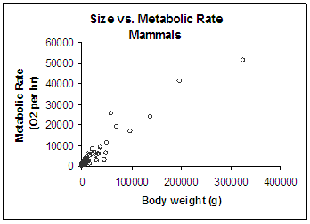
Wait a second - didn't we say that there were data on 600 mammals??? There is no way that there are 600 points on that graph. Look at it! We can only see about, oh, we don't know, maybe 25 points!! Where did all the mammal data go?
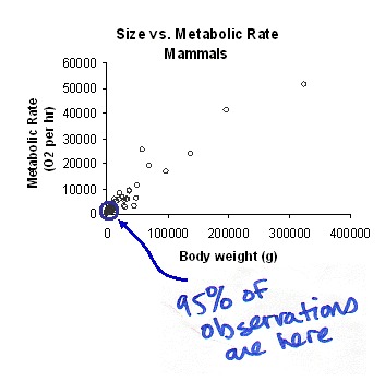
Let's take a second look at the axes. Both axes are displayed with a normal scale, meaning that each increment steps up an equal amount (increments of 100,000 grams on the x-axis). Let's think about the size of most mammals. Are most mammals small or big? How many different species of mice are there compared to, say, elephants? Like most organisms, there are lots and lots of species that are small and only a few that are big. In the case of our 600 mammals, about 95% are smaller than 15,000 grams. That means that the vast majority of our 600 data points are smashed into that first little segment of the graph.
It's impossible to see whats going on! Now lets look at the same graph with both axes scaled by factors of 10 (in other words, on logarithmic axes):
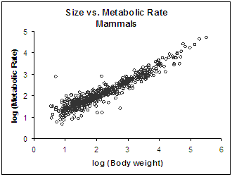
WOW! What a difference. There's still lots of points to look at - but they are now spread pretty evenly along both axes - so you can really see what's going on across all six orders of magnitude in size. What an improvement!
And there's one more thing to notice - now all the points fall across what looks like a very straight line. Why is that? Well, it turns out when you log-transform a power function, the resulting function is a straight line. Why would that be? That is what we are going to show you next.
Copyright University of Maryland, 2007
You may link to this site for educational purposes.
Please do not copy without permission
requests/questions/feedback email: mathbench@umd.edu