 Housecats exposed
| town | cats | songbirds |
|---|---|---|
| 1 | 2000 | 1600 |
| 2 | 3000 | 600 |
| 3 | 4000 | 200 |
| 4 | 2800 | 1200 |
| 5 | 600 | 2000 |
| 6 | 3500 | 400 |
| 7 | 1800 | 1800 |
| 8 | 500 | 4800 |
| 9 | 2500 | 1600 |
| 10 | 700 | 2200 |
In essence, we need to show TWO different trends here -- cats going up, and birds going down. So, there are a couple of ways we could do that:
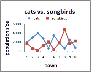
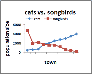
- put 2 lines on one graph -- first line showing cats, second line showing birds. Hopefully one will be going up as the other is going down!, or
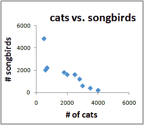
- put cats on the x-axis and birds on the y-axis
Two of the graphs below do a good job of showing the relationship between cats and birds, and the third does not. Can you tell which is which?
 |
Which graph is this?
|
 |
Which graph is this?
|
 |
Which graph is this?
|
A couple of points are very important:
1. If you're going to use 2 lines, then SORT the data first!! If you think cats are causing a decrease in the number of birds, sort the towns out from least to most cats (or most to least is fine too). If you don't sort the data, it becomes very hard to read the graph. Just because the datasheet has the towns in a certain order doesn't mean that's how you have to put them on the graph!
2. Cats and birds on different axes is probably the preferred format in scientific settings, because you can do other statistics on the data (like correlation and regression, which we won't discuss here). This is called a scatterplot (because the points are "scattered" around the graph). NEVER use a line or bars for this kind of graph. To do it in Excel, make sure to choose "scatter" or "x-y data" as your chart type.
Copyright University of Maryland, 2007
You may link to this site for educational purposes.
Please do not copy without permission
requests/questions/feedback email: mathbench@umd.edu