 Proving Polluted Ponds
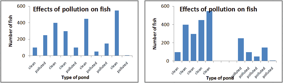
Here's the data from the 10 ponds, the way it was collected:
| pond # | type | #fish |
|---|---|---|
| 1 | clean | 100 |
| 2 | polluted | 250 |
| 3 | clean | 400 |
| 4 | clean | 300 |
| 5 | polluted | 100 |
| 6 | clean | 450 |
| 7 | polluted | 50 |
| 8 | polluted | 150 |
| 9 | clean | 550 |
| 10 | polluted | 0 |
How can you use this data to support your claim that pollution hurts fish?
First, you could take averages for the polluted vs. clean ponds. Try that now:
On average, how many fish are in the clean ponds, and how many in the polluted ponds.
(To make this problem interactive, turn on javascript!)
- I need a hint: DO NOT calculate an average for all 10 ponds!
- ... another hint ... : DO calculate an average for the 5 clean ponds
- ... clean ponds ... : The average is (100+400+300+450+550)/5 = 1800/5...
- ... and the polluted ponds ...: do the same for the polluted ponds
I think I have the answer: 360 fish in clean ponds, 110 in polluted ponds
So the averages make a pretty strong case that clean water is better for fish. What if you need some graphical backup? Which of these 2 graphs below would be better?
Copyright University of Maryland, 2007
You may link to this site for educational purposes.
Please do not copy without permission
requests/questions/feedback email: mathbench@umd.edu