Section 2: Reading Keeling's Curve
Now you know all about the origin of Keeling's curve ... let's find out how much information we can get from this single data series.
The next several pages pose several questions which you can answer by "reading" the graph. If you get stuck, click the button for a hint, then roll over the graph to find out how to read it.
Within vs. between year fluctuations
First, let's look at the changes in CO2 levels within one year, and from year to year.
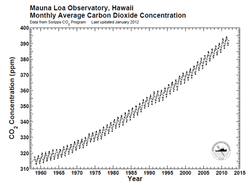
Approximately what is the yearly fluctuation in CO2 concentrations?
- Show me how ... :
Look at the height of one of the small peaks -- roll your mouse over the graph if you need help to do this
I think I have the answer: about 7ppm over a year.
Approximately how much did CO2 increase every year near the beginning of the timeseries?
- Show me how ... :
The difference each year is small, so look at the difference over 10 years -- roll your mouse over the graph if you need help to do this
I think I have the answer: From 1960 to 1970, about .8ppm per year.
Graph is from http://scrippsCO2.ucsd.edu/images/graphics_gallery/original/mlo_record.pdf
So, the seasonal difference is about 10 times as great as the rise in a single year. That's why the sawtooth pattern looks so prominent. But it also means it took only 10 years to reach unprecedented levels of CO2 in the atmosphere.
Copyright University of Maryland, 2007
You may link to this site for educational purposes.
Please do not copy without permission
requests/questions/feedback email: mathbench@umd.edu