Method 1: log, then graph.
Assuming you have a calculator, it's pretty easy to take the log (base 10) of each number and then make a graph on normal graph paper.
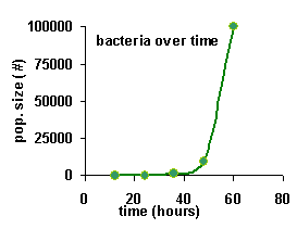
Here's an example. First, I'll just show you the normal graph. No logs involved here. Nothing up my sleeve, either. Before you click on "see the graph", try making a sketch on a scrap of paper....
| time (hrs) |
12 | 24 | 36 | 48 | 60 |
|---|---|---|---|---|---|
| pop. size (#) | 10 | 100 | 1,000 | 10,000 | 100,000 |


There is problem with this graph -- the y values (number of bacteria) are in the bottom 10% of the graph, except for the very last value. Because the last value is at least 10 times bigger than any of the other values, the other values all get squashed together at the bottom.
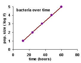
But, you should notice something interesting about the data. Every 12 hours, the number of bacteria increases by a factor of 10. So, what we need is a multiplicative scale. And that's what logs are. The log tells you how many places the number takes up -- in other words, how many times the number has been multiplied by 10.
Let's try the same graph, but take the logs of the data first. If you want to play along at home, get out your calculator, calculate the logs, and draw a graph. Otherwise, just click on the button that says "see the graph".
| time (hrs) |
12 | 24 | 36 | 48 | 60 |
|---|---|---|---|---|---|
| pop. size | 10 | 100 | 1,000 | 10,000 | 100,000 |
| log (pop. size) | 1 | 2 | 3 | 4 | 5 |


Copyright University of Maryland, 2007
You may link to this site for educational purposes.
Please do not copy without permission
requests/questions/feedback email: mathbench@umd.edu