Next step: ranging the axes.
Now that you have your axes, and labels for your axes, you need to think about what numbers go on the axes. The first step is to figure out the smallest and largest number that belongs on each axis. That's what "range" means -- find the range of the axis, or, find the biggest and smallest numbers that belong on the axis.
Obviously you know how to find the smallest and biggest numbers in a list. The tricky part is that these are often NOT the best numbers to use as the min and max of your axes. There are two reasons:
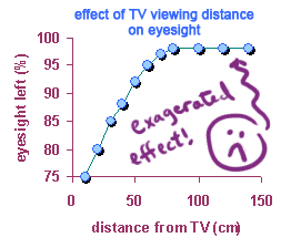
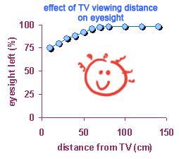
1. Almost always, the axes should start at 0, not at some other number. The reason is that starting someplace other than zero distorts the shape of the graph, usually making the rates of change look larger than they really are. (An exception is when the x-axis is showing time; for example you might start with the year 1990, rather than the year 0!) The graph on the left gives you a rather exagerated idea of how much TV viewing can damage your eyesight!
 |
 |
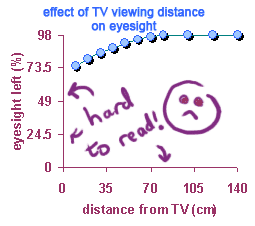
2. You want to pick maximum numbers for "x" and "y" that are nice and "round". The highest "y" value in a dataset might be 97.9%, but its a lot easier if your graph just goes up to 100. Look at the graph on the left -- it has very inconvenient maximum numbers on both axes. (Notice the bloodshot eyes!)
 |
|
Copyright University of Maryland, 2007
You may link to this site for educational purposes.
Please do not copy without permission
requests/questions/feedback email: mathbench@umd.edu