Know your axes
Here is the most well-known version of the so-called "hockey stick graph." It was originally published in the 2001 IPCC report:
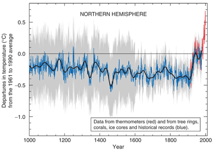
When you roll your mouse over the image, you will see how it got its name.
So let's investigate this graph a little. First,
What time period does it cover?
And...
What is being measured over this time period?
- Average world temperature: No, the average world temperature is not 0 degrees!! That would be really cold!
- How the average world temperature differed from the today's average: Yes! "Departures" basically means "differences between then and now." So, the zero line on this graph does NOT mean zero degrees. Instead, it means zero change between then and now. Furthermore, "now" is defined as 1961 to 1990 (you can read this on the y axis label).
Here's one way of thinking about this: Imagine a bunch of scientists sitting around thinking about how to represent world temperature over the last 1000 years. One of them says "Hey, if the world is really getting warmer, then we should compare the temperatures to the good old days." When were the good old days? When those scientists were growing up, of course!! Probably the 60s, 70s, and 80s!
Or, for those of you born in 1990, this graph measures how temperatures differed during the last 1000 years compared to temperatures during your parents' early lifetimes.
So, now that we understand the axes, let's go on and talk about the data itself.
Copyright University of Maryland, 2007
You may link to this site for educational purposes.
Please do not copy without permission
requests/questions/feedback email: mathbench@umd.edu